Using bohemian colors you can give your project a soft, natural and free-spirited feel. In this article you’ll find plenty of inspiration for your perfect boho color palette. I’ve created 7 different color schemes to inspire you, complete with hex codes.
What makes a bohemian/boho color palette?
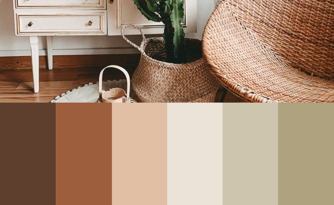
The boho look is characterized by its natural shades such as green, brown, sand, and taupe. The shades are somewhat muted to get that natural look. Additionally, a boho color palette may also include some warm hues inspired by the sun: warm terracotta shades and golden-yellow tones. The combination of those warm sunny hues with the soft green and beige tones gives your palette that specific boho vibe.
Using the hex codes
Each color swatch has its own hex code, which you can use to select the exact color in tools like Canva or Photoshop.
You can use the boho color palettes for various purposes. They are perfect for creating your visual brand identity, can be used as a wedding color scheme, as a color combination for an illustration, for a poster/invitation, and can even serve as color inspiration for your interior. Plain and simple, wherever you need color! 🙂
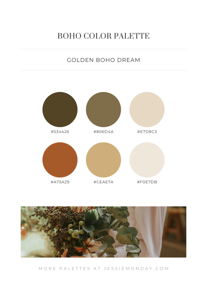
An earthy boho color palette
First up is this earthy palette that contains beautiful deep green shades with a hint of brown in them, and a lovely brown terracotta-like shade. The golden yellow color adds a lot of warmth to the palette.
A modern boho color palette
This palette is modern and accessible. The colors are neither too dark nor too light, and contain a beautiful balance between warm colors (red, brown, beige) and cool colors (the grayed green tones). It’s a wonderful color palette for designing a branded website but also highly suitable for a wedding.
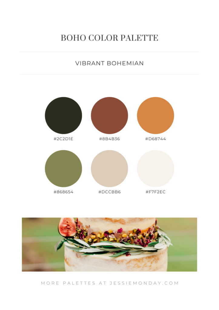
A bright boho color palette
Clearly the most vibrant palette in this series. Although the color scheme is still totally boho, the colors are just a bit brighter and ‘pop’ a little more. Perfect for when you need that extra bit of oomph in your project.
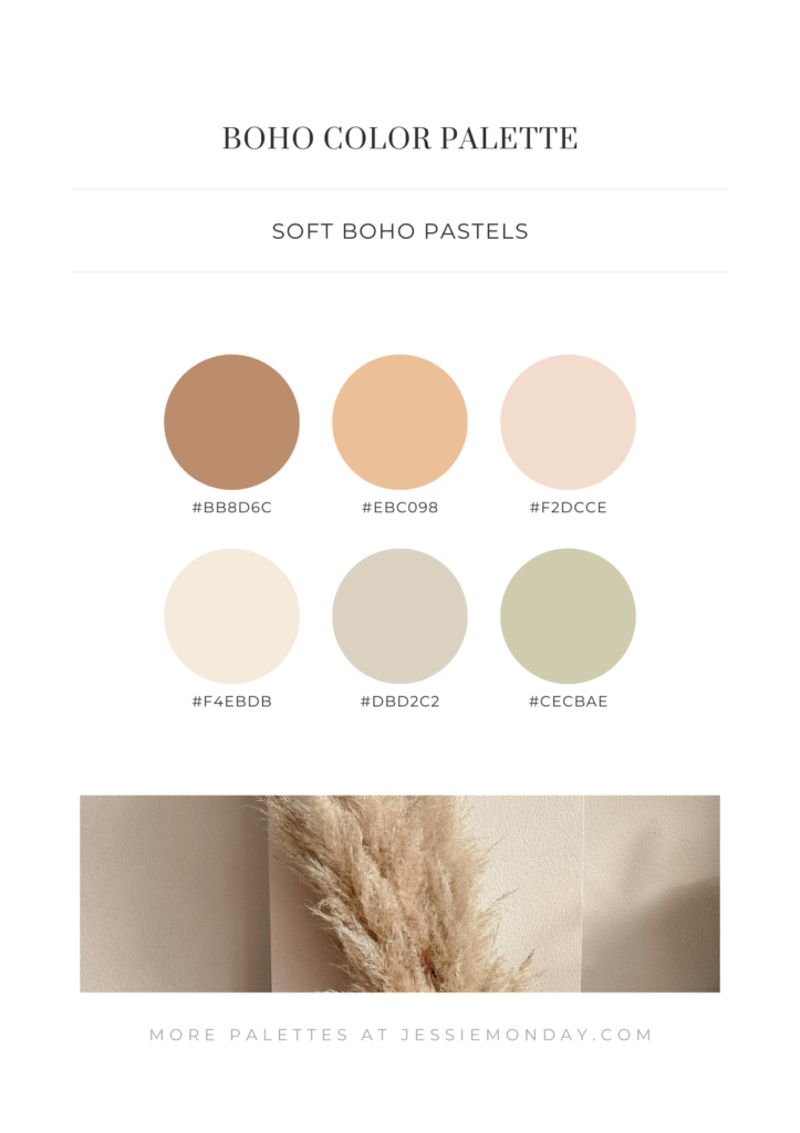
A neutral boho color palette
Looking for a softer palette with more neutral colors? This might be perfect for you. Sweet and soft pastel colors that i would imagine to look great on something like a birth announcement card or a first birthday party invite.
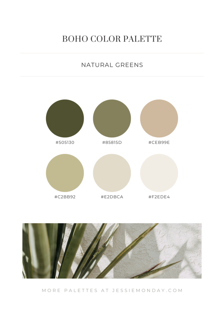
A green boho color scheme
Love those green boho shades? Me too. I’ve created this green boho palette to really highlight those green tones. Some of the greens have a little brown mixed in them, and some have a little bit of grey.
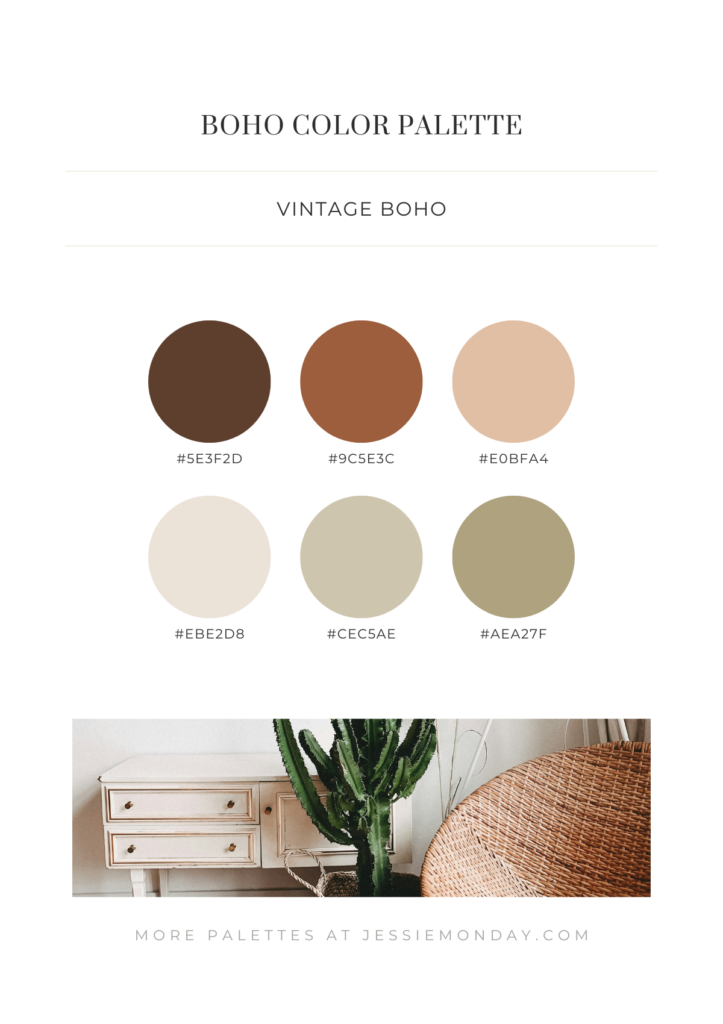
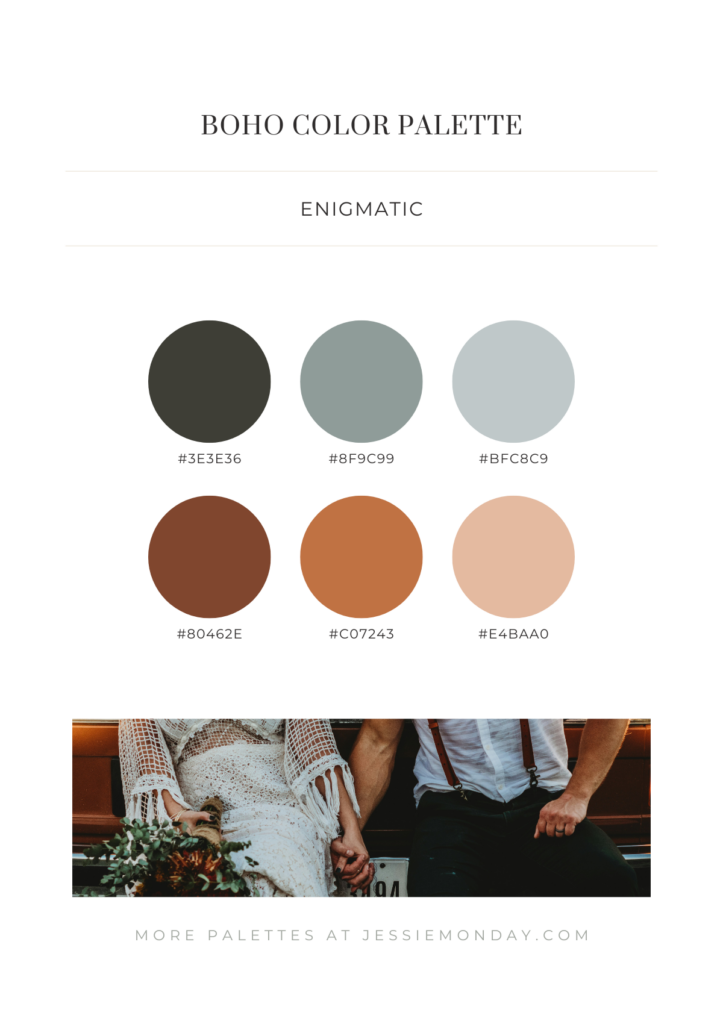
A darker boho vibe
To create a darker, more enigmatic boho vibe you can swap the green hues for blue and grey hues.
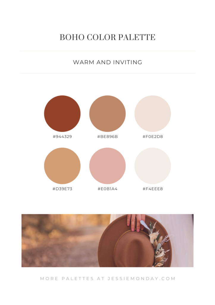
Warm boho colors
This last palette focusses on those warming boho colors. Warm terracotta brown, a sunnier orange-brown hue, and even a blush color. Warm and inviting.
More color inspiration?
Need a bit more color palette inspiration? No problem. Check out these green color palettes, pastel color palettes, blue color palettes or even these eucalyptus inspired color palettes. I’ve also created an earth tone color palette collection.
Be sure to pin your fav palettes to your pinterest boards so you won’t lose them!
3 Comments