Pastels are a populair choice in visual design. The soft, toned down colors are easy on the eyes and fit in a lot of styles. I’ve put together 5 palettes you can use to draw inspiration from, and to use in any project you like.
How to use color codes
Simply type the # color code into the color picker of your design tool such as Canva or Adobe Illustrator. Found a palette you love? Feel free to use, and to pin it to your pinterest boards.
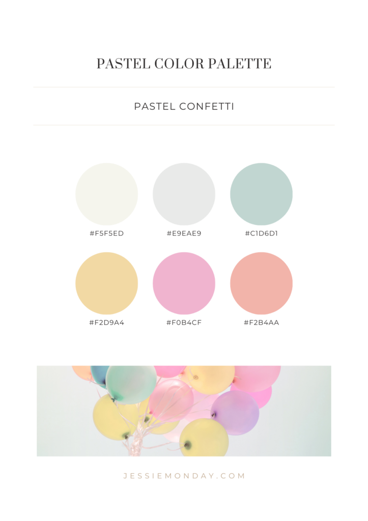
Pastel confetti
Let’s start with the most colorful palette of the bunch. I call this one pastel confetti! 🙂 Just happy vibes. This color palette would be great to use on a birthday card or invitation, or a fun and happy branding for a flower shop or a children’s clothing store.
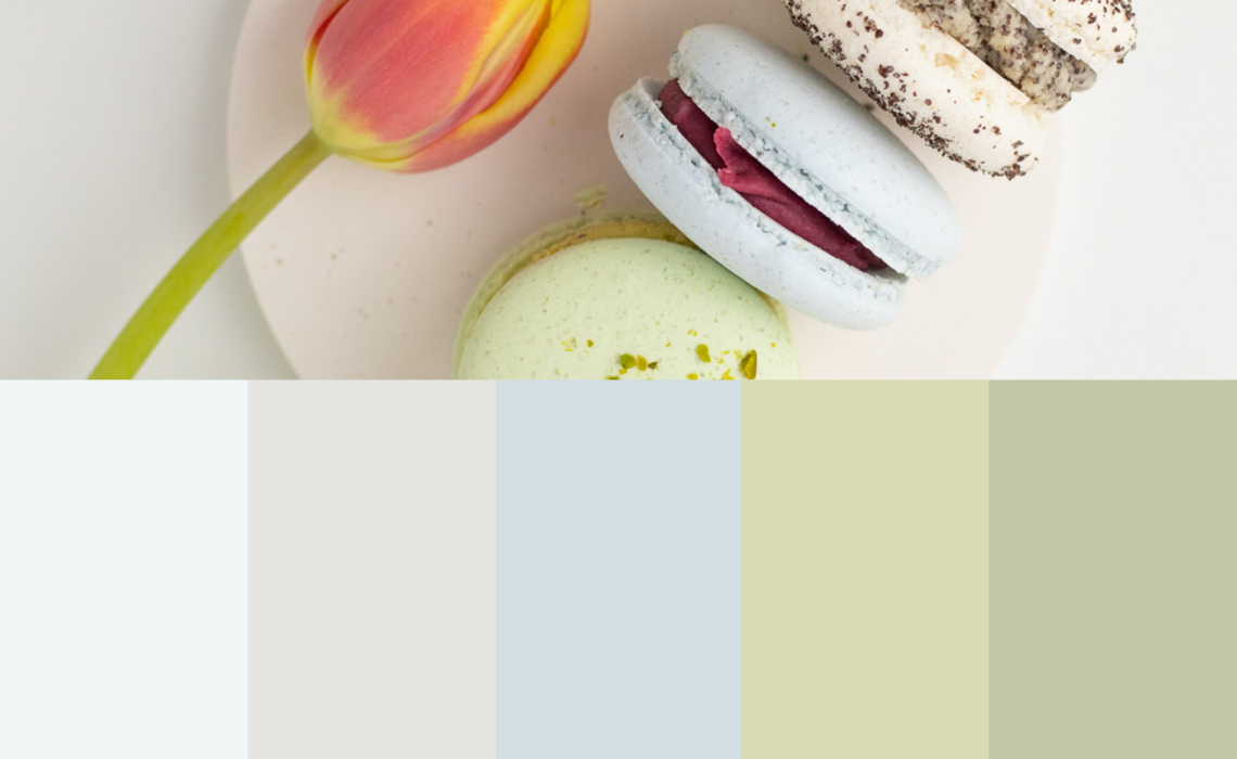
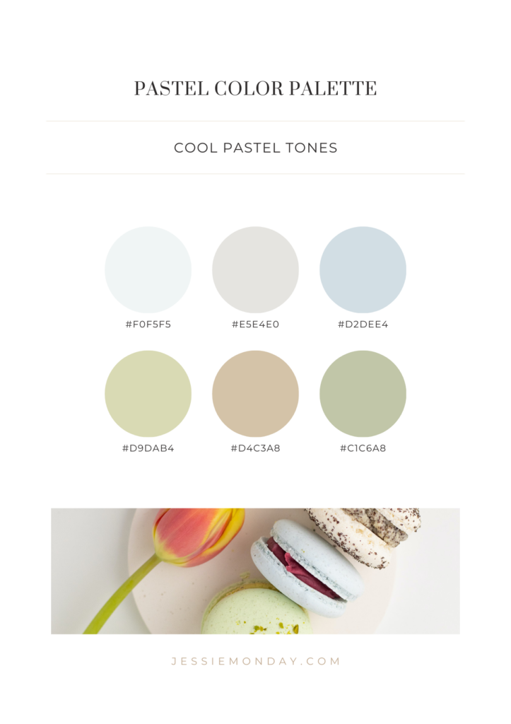
Cool pastel tones
What about cool pastel tones? Blue and green are cool colors, and paired with they greys and the brown this makes a balanced palette that can be uses for various purposes.
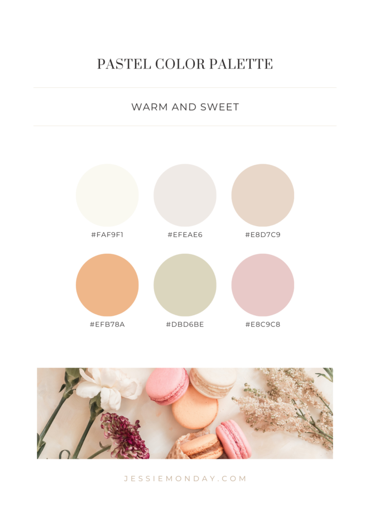
Warm and sweet
Next up are the warm pastel colors. Soft, sweet, and a bit vintage looking. I love it!
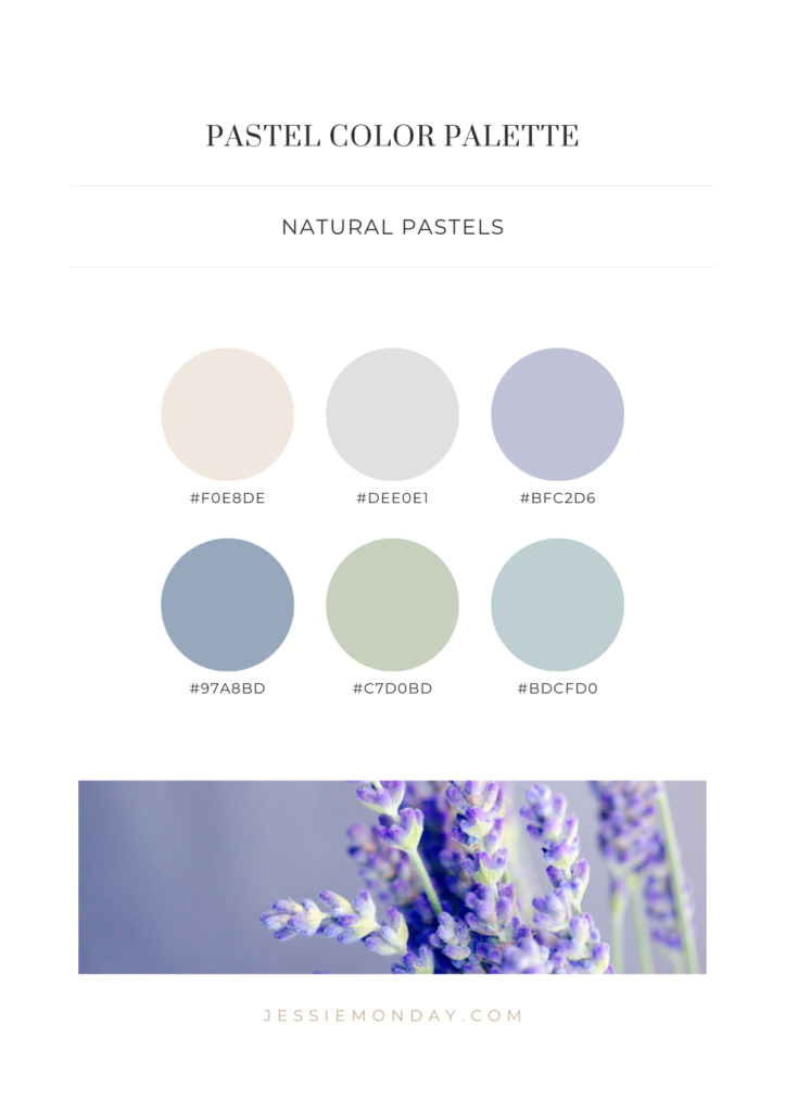
Natural pastels
How pretty is this blue and lavender palette with a touch of green? Just a lovely, natural calming vibe. If I were to use this palette in a visual branding, it would be for a welness business such as a spa, or a natural product such as organic soaps.
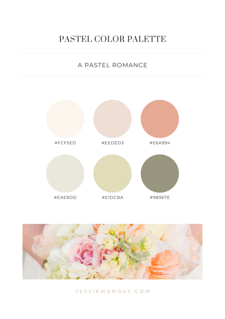
A pastel romance
The final palette is a romantic one, inspired by a gorgeous wedding bouquet. With soft warm blush and peach colors combined with the cooler tones of green. The perfect balance.
1 Comment