Next to those vibrant and colorful autumn palettes from my earlier post we have her gothic little sister: moody autumn. I’ve created 7 palettes that give off that moody, gothic autumn vibe. Suitable for a more serious project and/or design while still keeping that warmth. Mix and match your favorite colors or use them as inspiration to create your own!
What is a moody autumn color palette exactly?
A Moody Autumn color palette is a rich, warm, and deep collection of hues that capture the essence of autumn at its most intense. Think of the colorful but darkened forest leaves, foggy and cloudy sunsets, and moody but cosy hues you’d see on rainy days.
How to create your ultimate moody autumn color palette
Moody Autumn is characterized by a combination of warm undertones and cooler, dark shades, so be sure to add both to your own palette. Try burnt orange, moss green, dark teal, and aubergine, and pair them with rich neutrals such as chocolate brown and charcoal gray. Colors with a strong, vivid presence that exude warmth and depth.
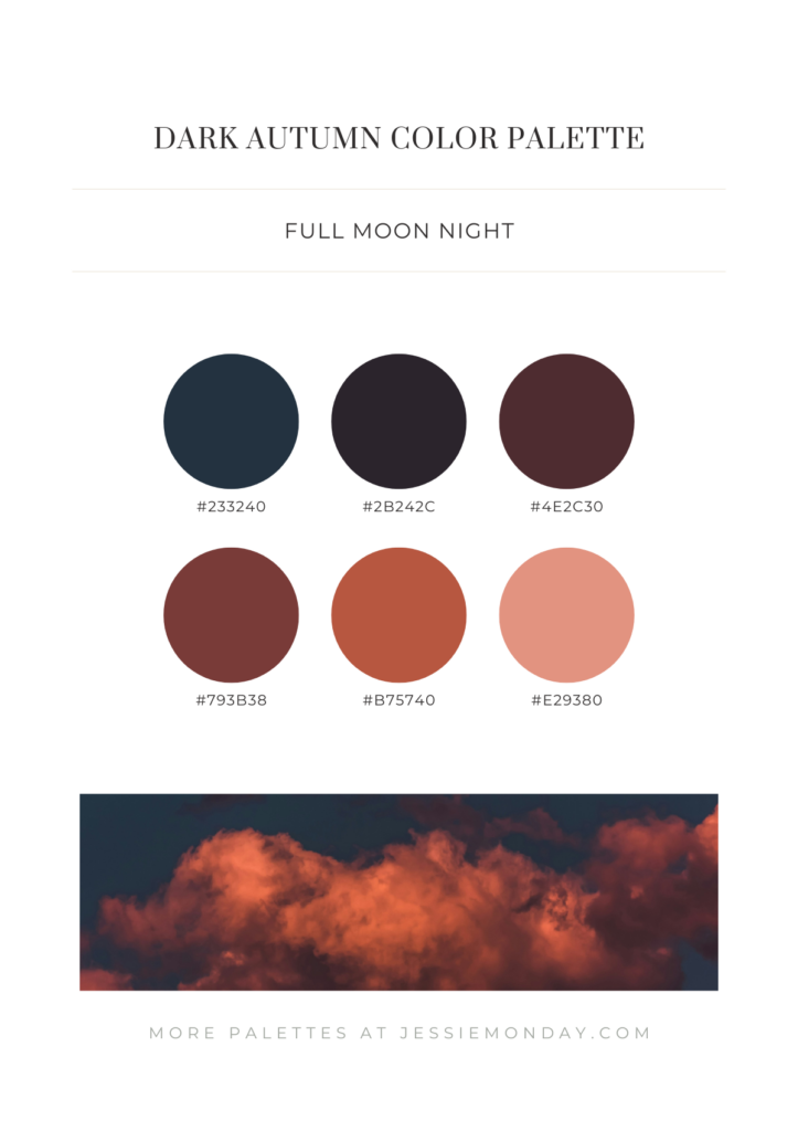
Full Moon Night
Inspired by a dark and moody full moon night, using 3 very dark shades of blue, grey and aubergine, but paired with 3 warm and vibrant brown and orange shades to represent the autumn moonlight.
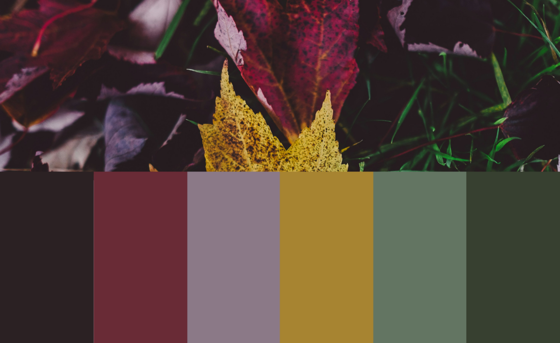
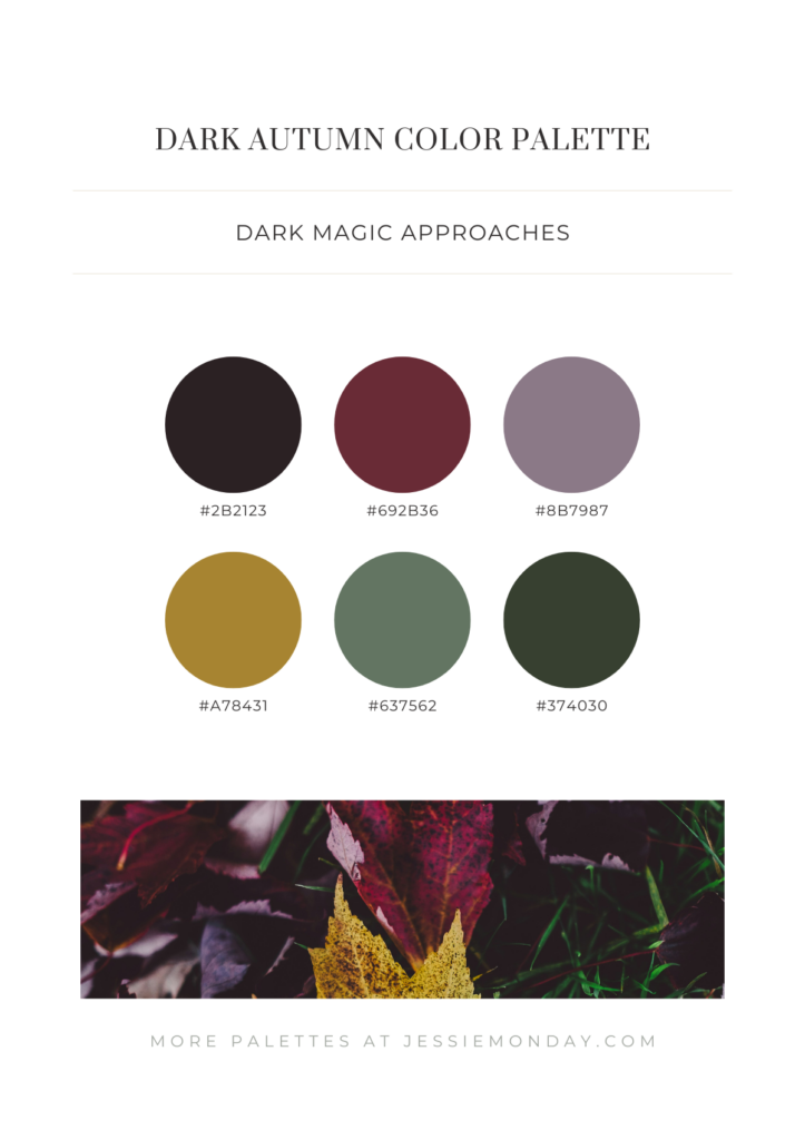
Dark Magic Approaches
This palette made me think of Harry Potter – Slytherin specifically – hence the name. 🙂 I just love the burgundy color in combination with that dark mustard yellow and the green hues. A magical but dark vibe. Do you agree?
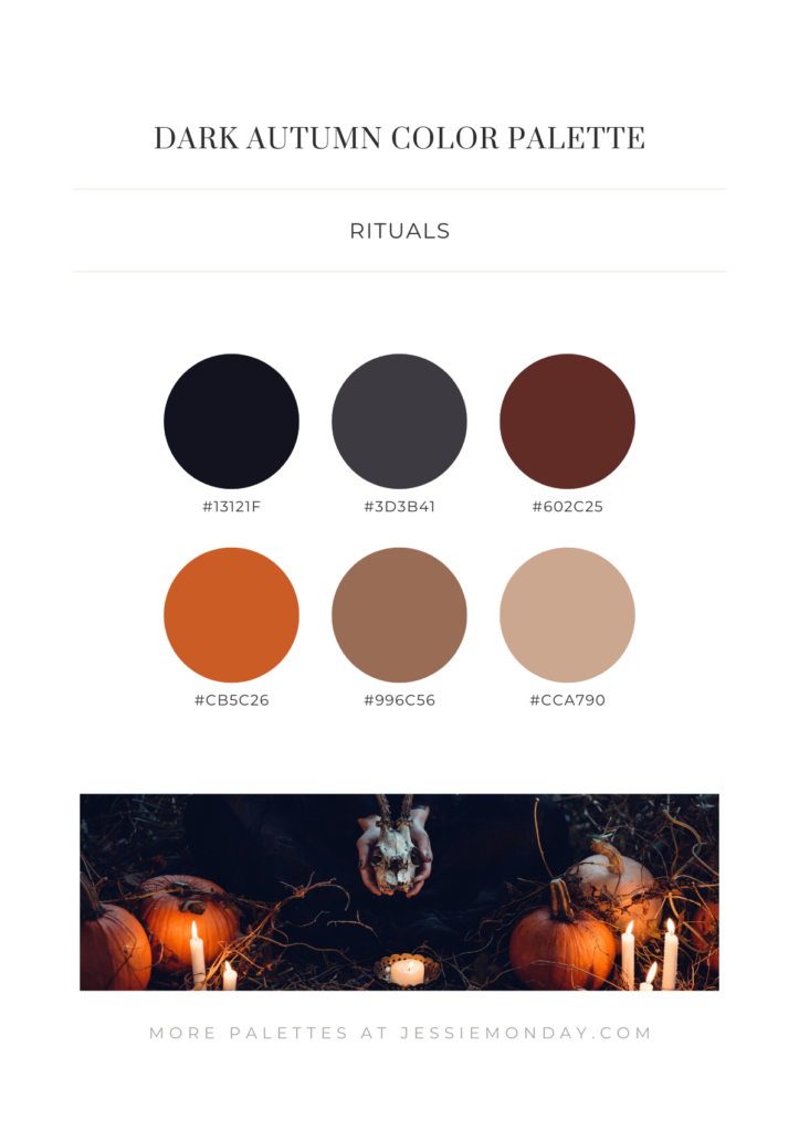
Rituals
Inspired by a more gothic horror theme, the palette below contains 3 very dark shades with a pop of pumpkin orange, and some neutral browns.
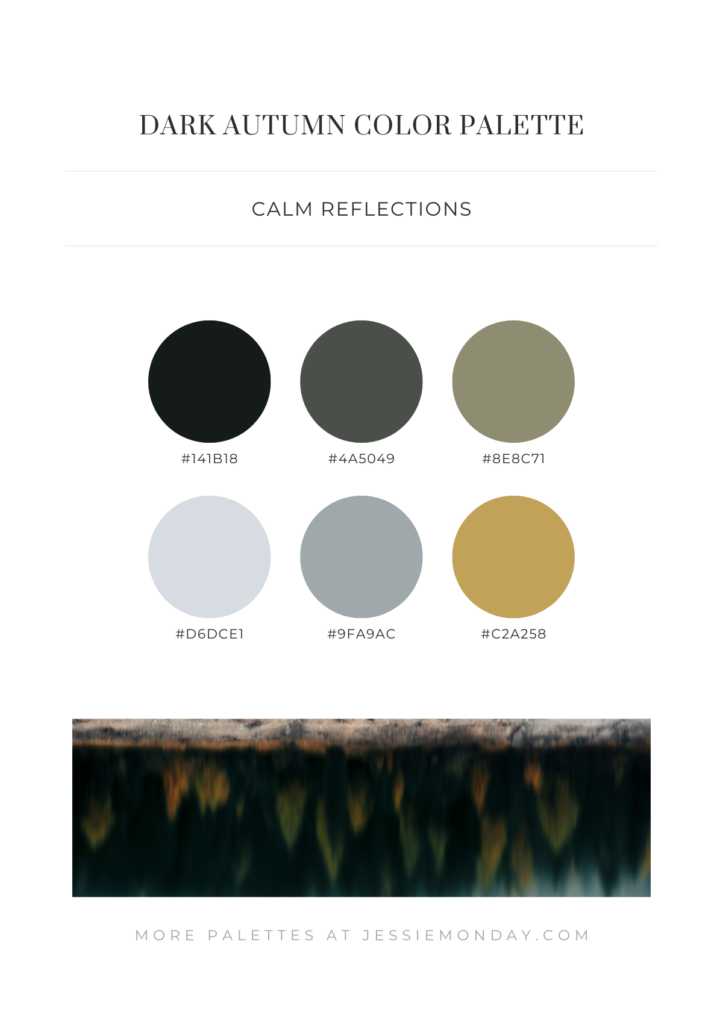
Calm Reflections
I also wanted to add a palette without the warm orange and brown tones, representing the transition from summer to fall. This palette is inspired by an evergeen forest in autumn. So lots of green and grey hues, but with a splash of muted yellow.
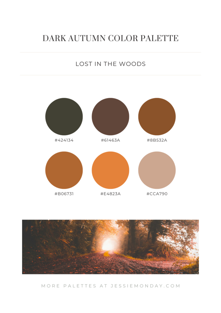
Lost In The Woods
All the warm brown and orange hues you could need. 🙂
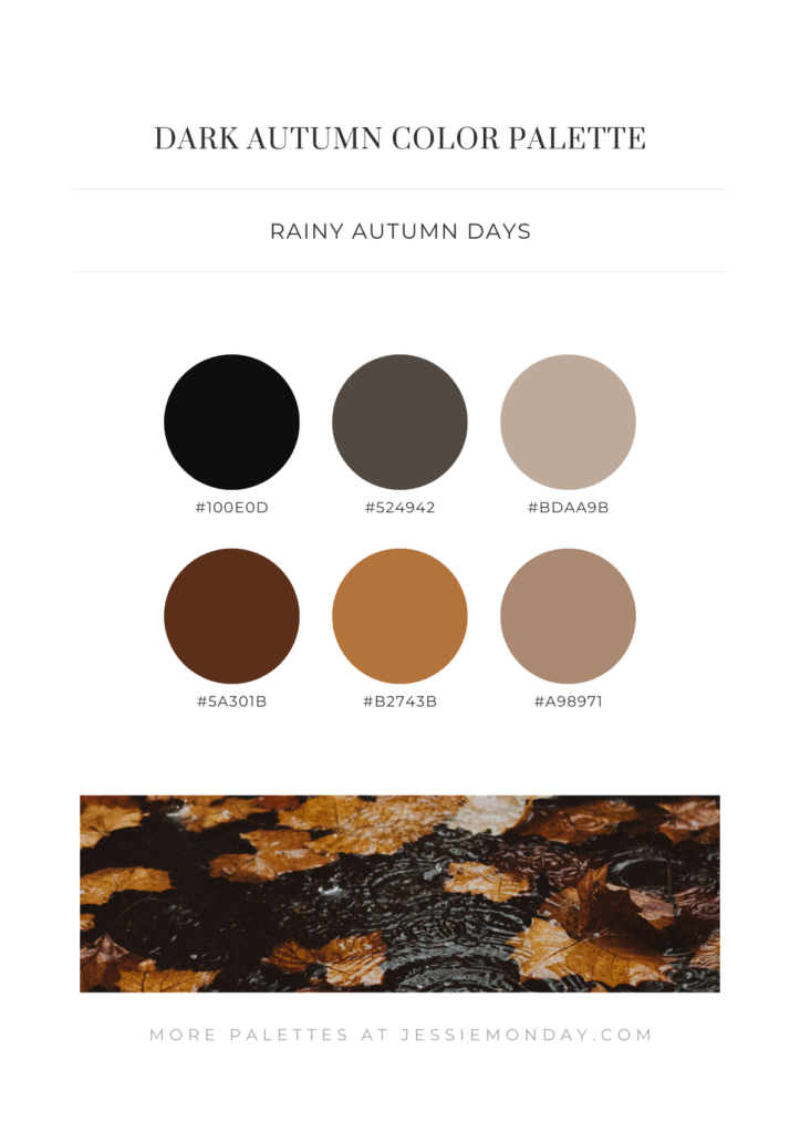
Rainy Autumn Days
A dark but cosy palette that reminded me of those rainy days.
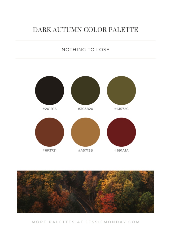
Nothing To Lose
A balanced palette filled with all the colors of autumn, but very toned down and muted. A bit like taking a walk in the woods or a drive through the woods when the evening sets in. I love that little pop of gold next to the dark red and dark green.
More autumn color palettes
I hope you loved my dark and moody palettes! Check out my original autumn color palette blog for some lighter, more vibrant autumn color palettes.
2 Comments