Spring is in the air, and that means it’s time for fresh, vibrant color inspiration! I’ve put together some spring color palette inspiration to help you bring that light, joyful feeling into your designs. Whether you’re working on a seasonal project, refreshing your brand, or just looking for some creative inspiration, these palettes are here to spark new ideas. As always, I’ve included the hex codes for each color, so you can easily use them in your own work.
What Makes a Color a Spring Color?
Spring colors are all about softness, freshness, and new beginnings. Think of the first blooms of the season, pastel sunrises, and the fresh greens of budding leaves. While pastels like blush pink, lavender, and mint green are classic spring shades, brighter hues like sunny yellow or sky blue also bring that lively, cheerful energy. The key is to keep things light and airy—nothing too heavy or muted. Spring is all about feeling refreshed, and the right colors can do just that!
7 spring color palette examples with hex codes
Looking for the perfect spring color combination? Below, you’ll find seven fresh and inspiring palettes, each with carefully selected hues and their hex codes—ready to use in your next project!
Sweet Blossom
This first palette is inspired by one of the most beautiful signs of spring: blossoms! Soft pink shades with a touch of red and brown create a warm and delicate feel. The addition of a muted blue (with a hint of red) represents the sky and adds a cool contrast to balance the warmth. A gorgeous palette for feminine personal branding or even a wedding!

Brand New Day
Let’s dive into nature with this next palette. 🙂 I absolutely love these soft, muted green tones. Paired with gentle blues and pinks, they create a dreamy, fairy-tale-like vibe. This combination works beautifully for interiors—think a cozy nursery—but also for branding a natural, organic business. So many possibilities!

Fairytale Spring
Purple is a must-have in a spring palette. It adds a bit more depth and can give your color scheme a slightly mysterious touch while still keeping that fresh spring feel.

Sunny Days
Looking for something a bit more cheerful? Then this palette with vibrant pastel tones might be just your thing. It’s playful, soft, and feminine all at once!

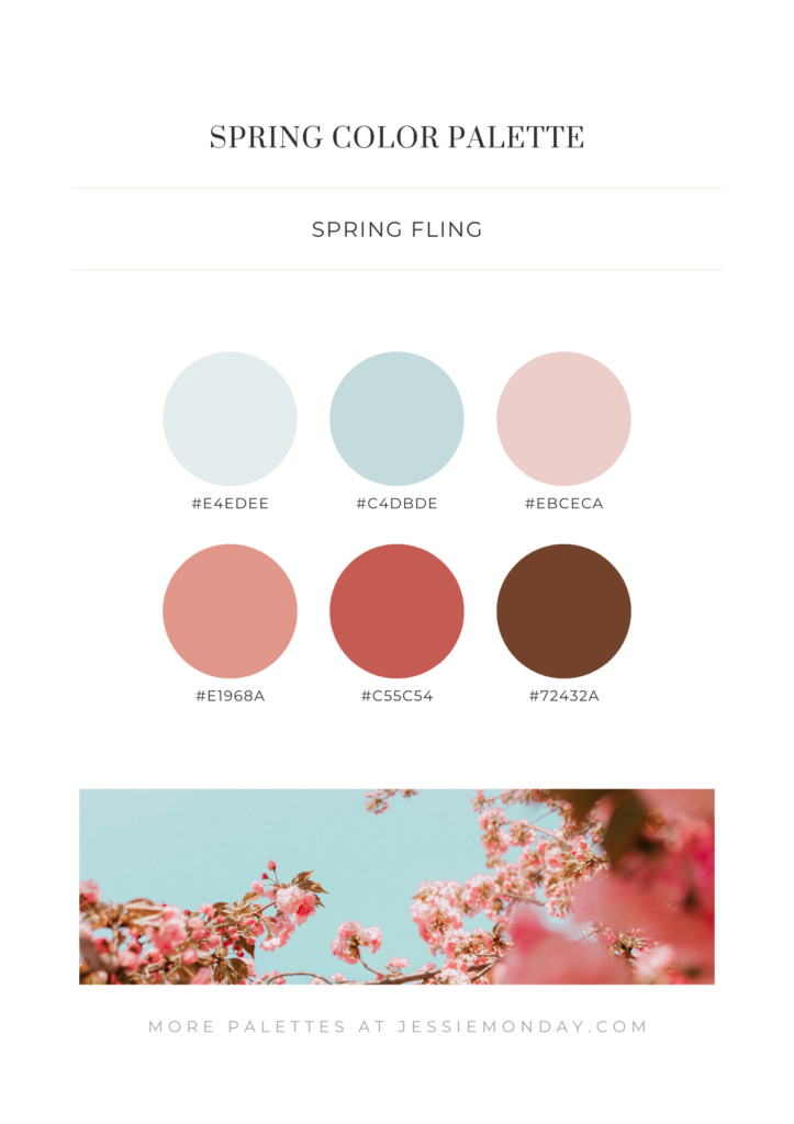
Spring Fling
Want your spring palette to feel a bit more serious and professional? You can achieve that by bringing in some brown tones. Brown adds a sense of reliability and warmth. Combined with soft blues and dusty pinks, it creates a grounded yet cheerful look.
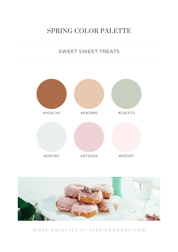
Sweet Sweet Treats
The sweetest of the bunch! Doesn’t this sugary color palette instantly make you crave something sweet? 🙂
Lush
Here’s a bolder palette with richer tones, yet still soft and cheerful enough for spring. It works beautifully when paired with a light cream background in your designs.

Flower Picking
And finally, this ultra-romantic and fairy-tale-like color palette. Perfect for a wedding! If you want to use this palette in branding, you might need an extra contrast color or go for black or charcoal text on a white background, using these colors as accents.

More color inspiration?
I have plenty more color inspiration ready for you! 🙂 In the same theme, I also have pastel color palette inspiration. And maybe you’ll find something beautiful for your project in neutral color inspiration too!