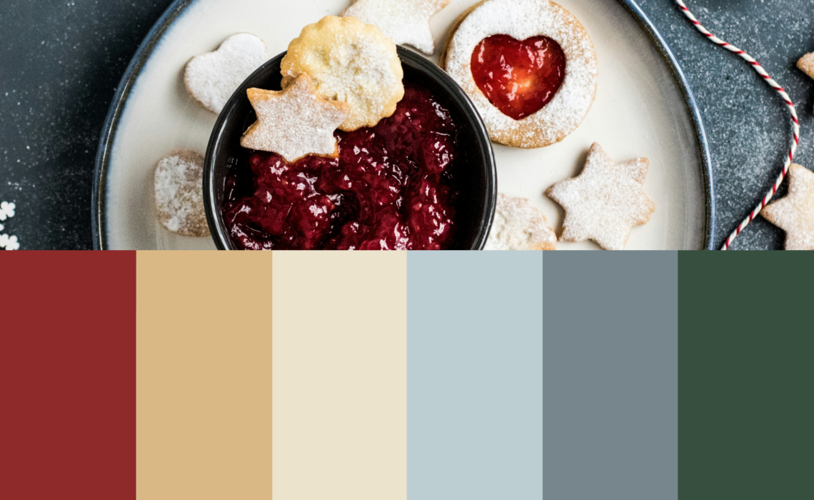
Looking to add some festive cheer to your designs? Check out my Christmas color palette examples! I’ve put together 12 unique and free Christmas color palettes to inspire your holiday projects. Whether you’re working on Christmas greeting cards, invitations, or social media posts, these palettes will help you capture the magic of the season. Plus, I’ve included the hex codes for each color, so you can easily use them in your designs.
What colors are christmas colors?
Traditional Christmas colors are often associated with red, green, gold, and white. Red and green represent the christmas trees and decorations, while gold adds warmth and elegance, and white symbolizes snow and winter. However, Christmas colors aren’t limited to just these! Many modern holiday designs incorporate shades like icy blues, silvers, pinks, and even darker hues for a more contemporary feel. The beauty of Christmas colors is that they can reflect a range of moods, from classic and cozy to playful and bold.
My 12 Christmas color palette examples – with hex codes!
Below you’ll find my 12 personally curated Christmas color palettes. From traditional and cheerful to modern, and from bright and bold to moody and cozy. You can use these palettes as they are, or mix and match your favourites. The hex codes can be easily applied in Canva, Adobe Illustrator, Adobe Photoshop, Procreate and more.
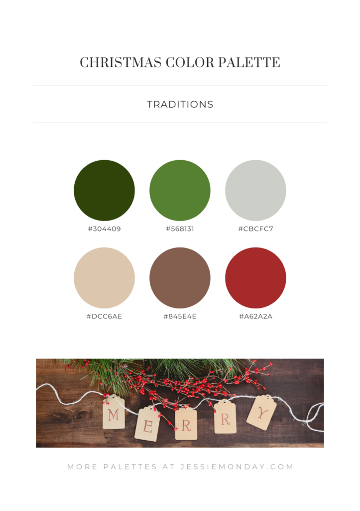
Let’s start with a beautiful, traditional Christmas color palette. Warm shades of red and taupe combined with various shades of green. You can never go wrong with this classic color combination.
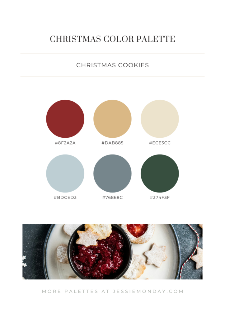
With this palette, we introduce a more wintry vibe to the traditional colors, thanks to the two icy blue shades. The warm burgundy red and golden tones create a lovely balance between warm and cool colors, while the dark pine tree green adds the perfect finishing touch to the Christmas feel.
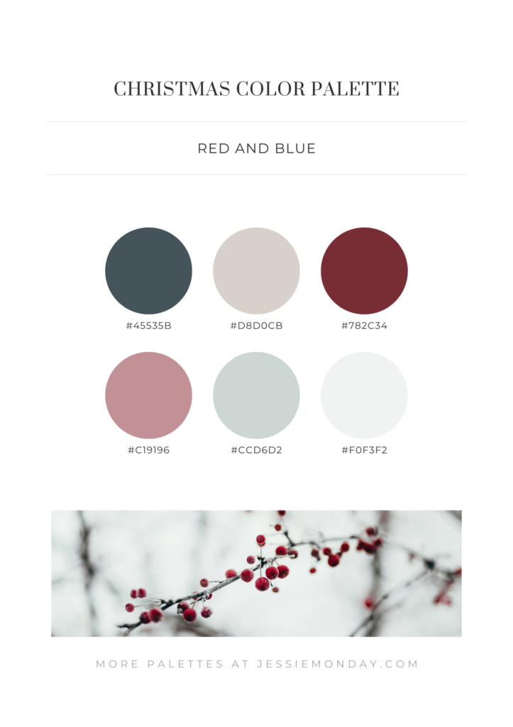
With this third palette, we step away from traditional colors for a more modern feel. The colors are inspired by a beautiful berry branch in the forest on a crisp winter day. The dusty pink and pastel blue shades are perfectly in line with the latest Christmas trends.
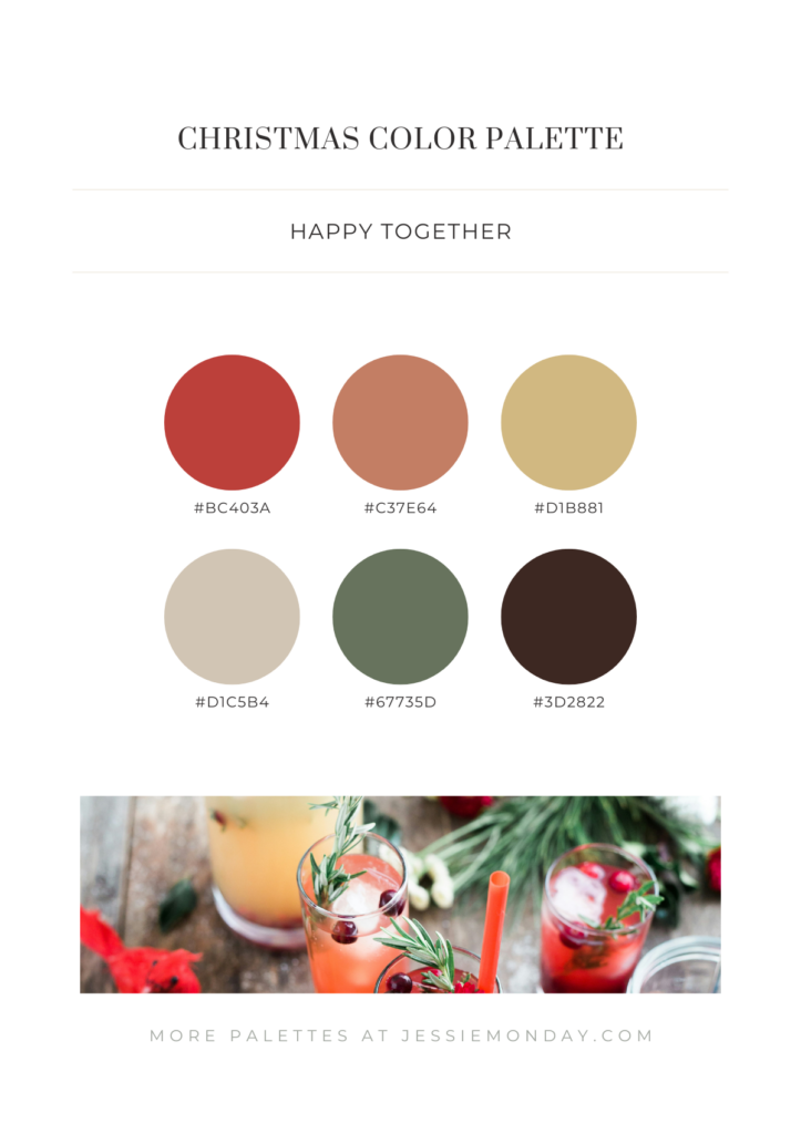
Back to a more classic palette, but with more muted tones. This is a beautiful palette, perfect for something like an invitation to a Christmas dinner party.
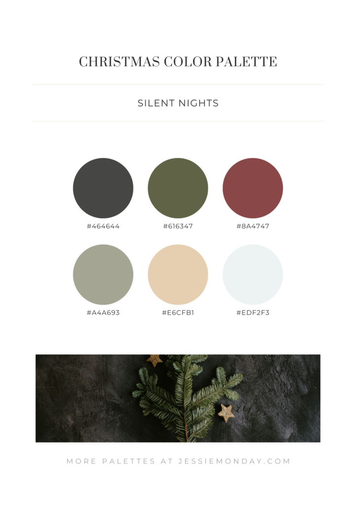
Beautiful muted green tones and the deep dark red give this palette a more serious tone, yet it still exudes warmth.
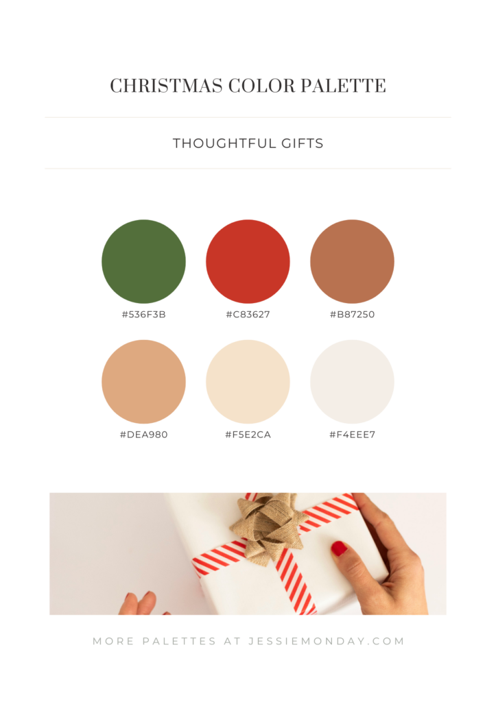
Cheerful shades of red and green, along with warm golden-brown tones, give this palette a bright and inviting feel. If you use this palette, I recommend keeping the background white or very light taupe to maintain the freshness of the colors.
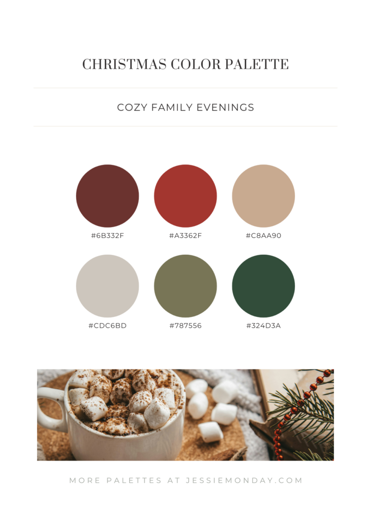
In this palette, I’ve toned down the traditional colors to more muted and greyed-out shades. This gives a look that feels a little cozier and warmer.
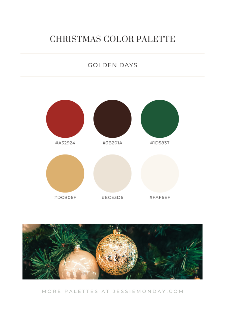
Bright greens, reds, and golds. Simply a beautiful traditional palette, complemented by warm sandy accents.
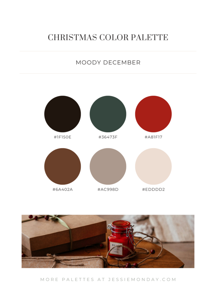
This palette is the moodiest of the bunch. By deepening the colors, you create a darker, more atmospheric vibe.
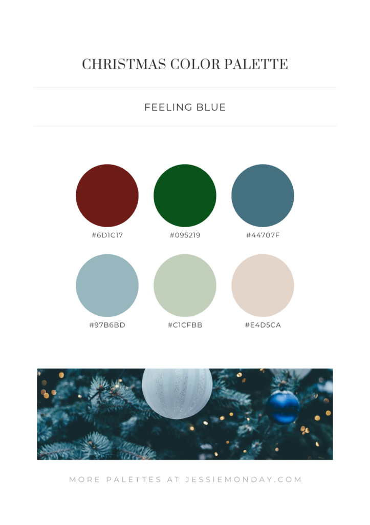
I find muted blue tones to be a beautiful addition to the traditional green and red palette. It’s as if you’re capturing both Christmas and winter in one palette.
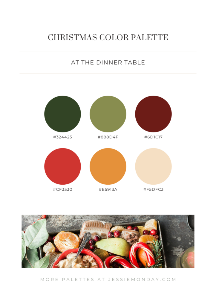
A beautiful palette with vibrant colors – inspired by a festive meal.
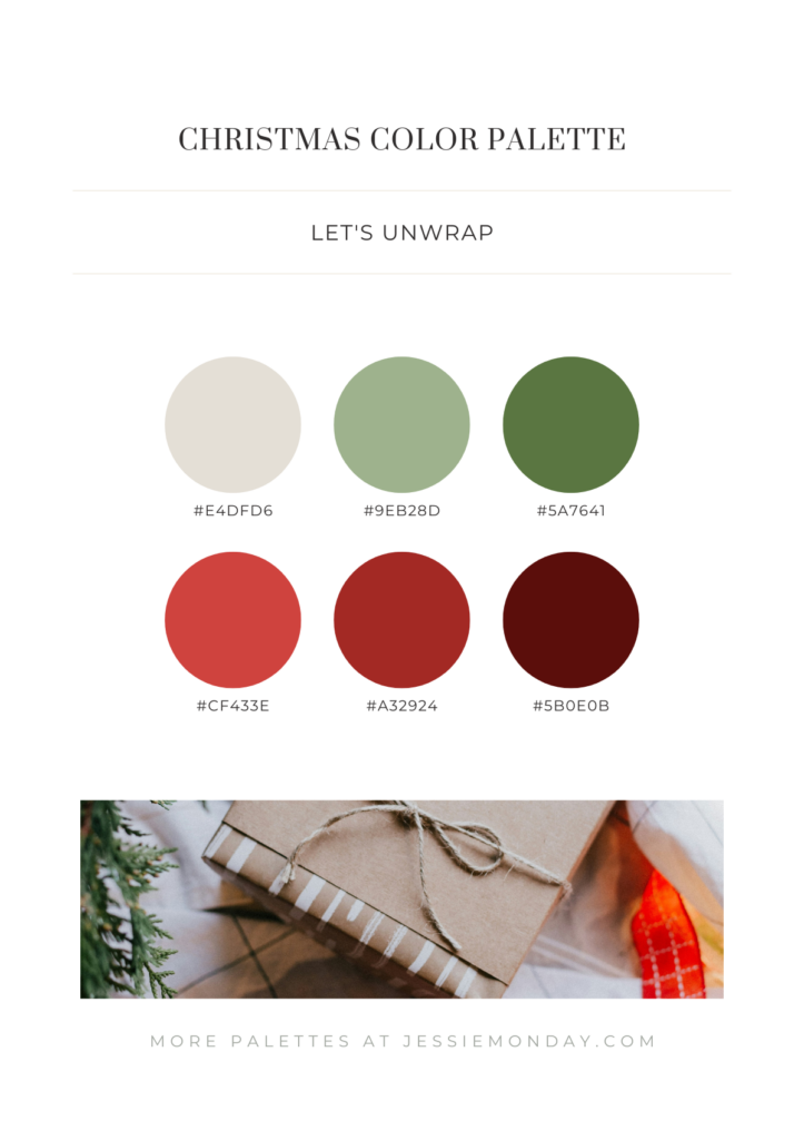
And we finish with something more traditional: green and red. Use this classic combo in different shades to add more refinement and depth to your design.
More christmas inspiration
Can’t get enough of christmas? I get it! 🙂 I’ve created an article filled with christmas fonts and colors, including 10 designed examples. Also check out my winter color palette inspiration blog for some similair palettes.
