How do you choose the colors that best represent your brand, and what should you consider when putting together your branding color palette? I’ll guide you through the process and tell you everything I know.
My guide to picking your brand colors like a pro
This guide is for small business owners and for those who are just starting their business and have no budget to hire a designer. I am a graphic designer with over 12 years of corporate experience, and I also enjoy helping my family and friends with their business ventures.
When you’re building a business there’s a thousand things on your to-do list and you’re wearing multiple hats. You suddenly have to deal with things that are outside your area of expertise and perhaps even outside your comfort zone. For many, graphic design and branding are exactly that. Vague concepts, but super important ones. So this is where I like to jump in and offer you some guidance. Because when there is no room (yet) in your budget to hire a designer, you’re going to have to do it yourself. And you’ll do great!
If you follow the guide, i guarentee you’ll be able to put together your own professional color palette.
Picking your brand colors – starting from zero
Feeling overwhelmed? Not sure what to do, where to start, where to even LOOK? I totally get it. Let me introduce you to the 4-step plan:
- Mapping out what your business or brand is about
- Determining your target audience and ideal customer
- Choosing colors using color psychology
- Creating your branding color palette
That sounds doable, right? First, we’ll make sure you know exactly what you want to communicate with your branding and that it aligns with your target audience.
Next, we’ll make thoughtful choices by learning more about the psychology behind different colors and how to leverage that knowledge.
Finally, the most fun part: creating a beautiful and balanced palette. I’ve included a free canva template you can use to create your branding color palette in.
Mapping out what your business and/or brand is about
Get some pen and paper and delve deeper into the essence of your product or service by answering the following questions:
- How do you want customers to perceive your brand?
- What three words would you like customers to use to describe your brand?
- Is there a story or ethos behind the brand that you want to communicate?
- Do you have preferences for colors, fonts, or visual styles that appeal to you?
- Are there existing brands whose visual style you admire?
- What emotions or feelings do you want to evoke with your brand design?
- What messages are most important to convey in your marketing?
Gather al your answers and design inspiration and put them together in a moodboard.
Determining your target audience and ideal customer
Now let’s take it a step further define your target audience and ideal customer by answering the following questions:
- What are the demographic characteristics of your ideal customer (age, gender, education level, income, occupation)?
- What are the interests, hobbies, and passions of your ideal customer?
- What values and beliefs does your target audience hold?
- How does your ideal customer spend their free time?
- What specific needs does your ideal customer have that your product or service can fulfill?
- What problem do you solve for your customers with your product or service?
- What motivates your ideal customer to engage with your brand?
Take your answers and create another moodboard for your ideal customer.
Choosing colors using color psychology
Place your two mood boards side by side and compare them. Do they match? If so, you’re on the right track! You might already have some color preferences, but if not, that’s okay too. In this step, we’ll make a final color choice, using color psychology to rationalize the color selections.
Here’s an overview of every color and the emotions and convey. Try picking two colors that match with with your personal preference and your ideal customer. In the next step we will look at the shades and saturation of your chosen colors.
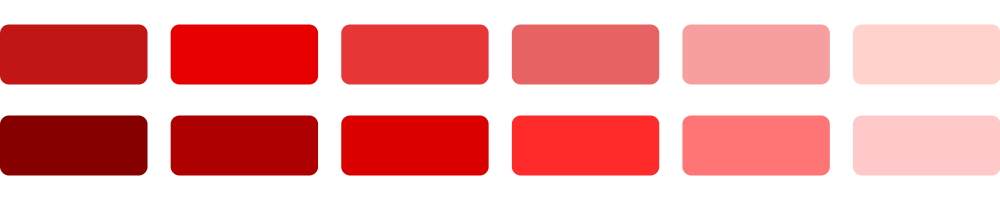
Red:
Emotions: Energy, passion, excitement, power.
Effect: Stimulates energy, can increase heart rate, often used to signal urgency.
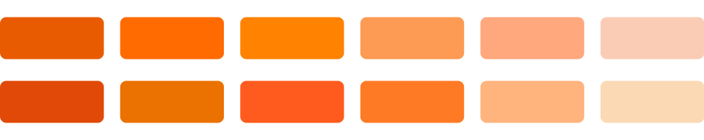
Orange:
Emotions: Friendliness, cheerfulness, confidence.
Effect: Often associated with creativity and adventure, can encourage social behavior.
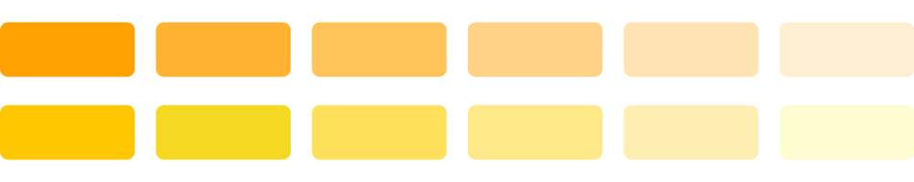
Yellow:
Emotions: Optimism, happiness, warmth.
Effect: Attracts attention, can be stimulating, often associated with cheerfulness.
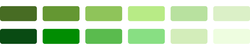
Green:
Emotions: Calmness, health, freshness.
Effect: Relaxing, often used to symbolize stability and growth.
See my green color palette inspiration blog for more color variations.
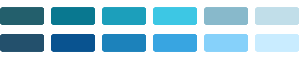
Blue:
Emotions: Calmness, trust, serenity.
Effect: Can be calming, often used in business and technological environments to communicate professionalism.
Take a look at my blog with blue color palettes for more blue color swatches.
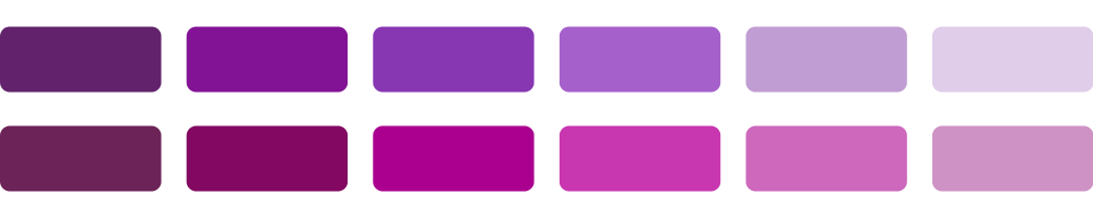
Purple:
Emotions: Luxury, wisdom, bravery, curiosity.
Effect: Often associated with royalty and luxury, can stimulate creativity.
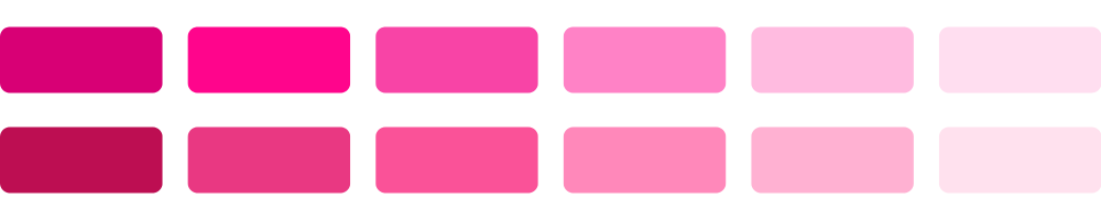
Pink:
Emotions: Romance, friendliness, softness.
Effect: Calming, happyness.
Brown:
Emotions: Stability, structure, nature.
Effect: Grounded feeling, can suggest safety and reliability.
For more brown color variations check out my neutral color palettes blog.
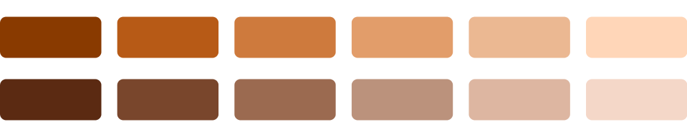
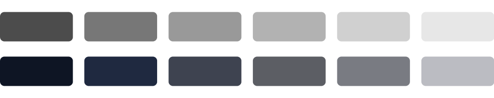
Gray:
Emotions: Neutrality, formality, sobriety.
Effect: Can convey stability and neutrality, is versatile in use.
White:
Emotions: Purity, simplicity, innocence.
Effect: Creates a sense of space and cleanliness, often used to emphasize simplicity.
Black:
Emotions: Power, elegance, mystery.
Effect: Can convey feelings of sophistication or power, often used in luxury brand identities.
Creating your branding color palette
Congratulations! You’ve successfully chosen your own branding colors with well-founded reasons, based on your ideal customer and color psychology, just like the pros do. We have just one step to go, and that is to expand your colors into a beautiful palette with the right shades.
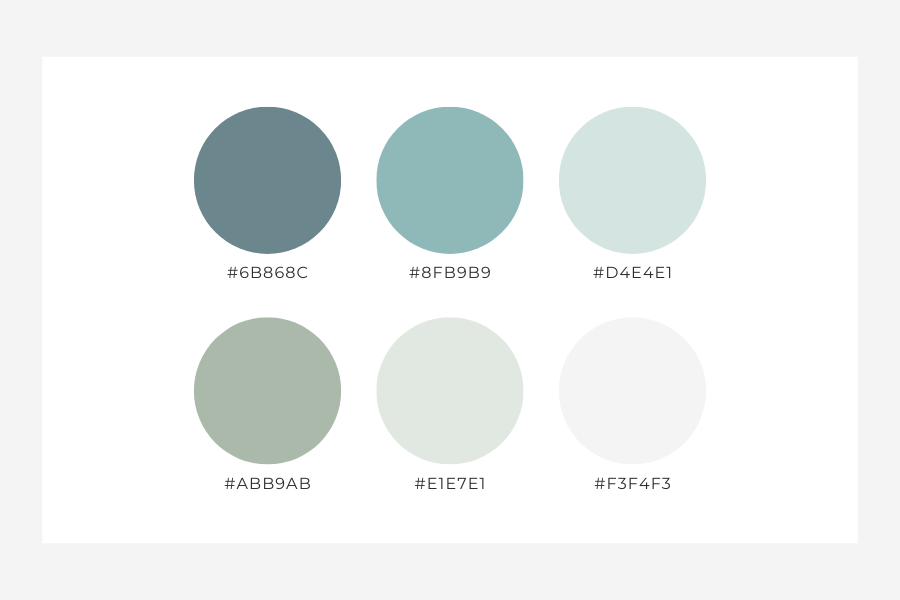
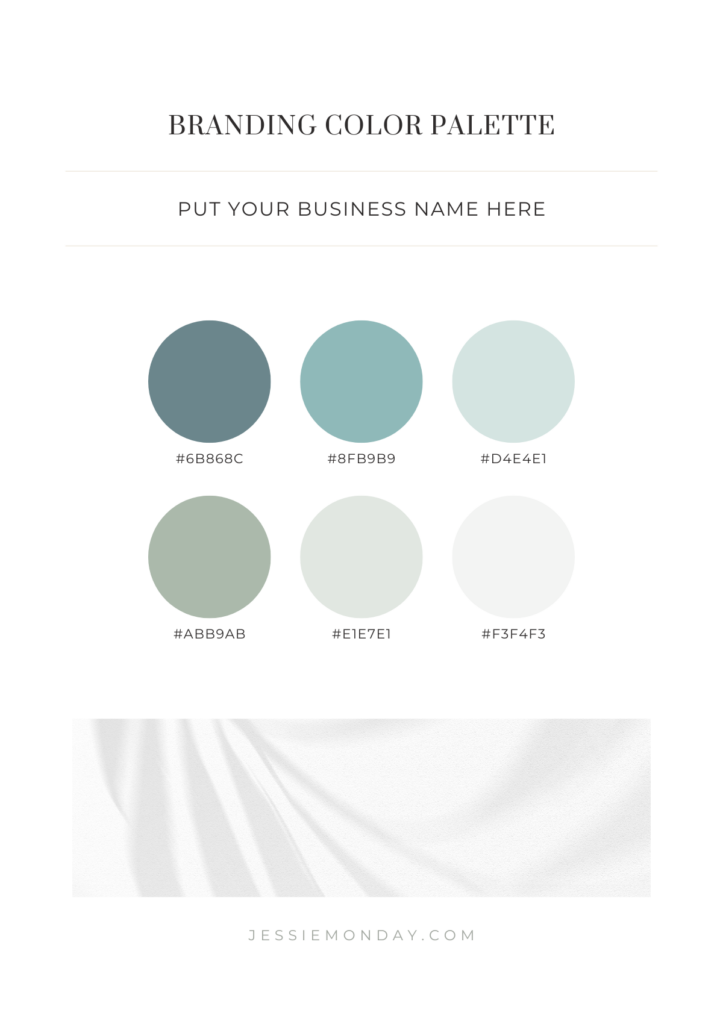
Take my free Canva color palette template and put your colors in. Put the primary color in the first row, and your secondary color in the second row like this:
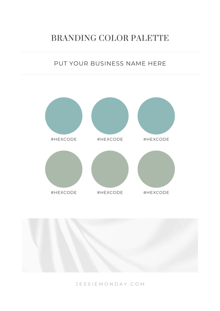
You can also change to image with one of your own or choose one from the canva library that matches your brand.
Now use the Canva color picker to pick 3 shades per color, starting with a darker shade on the left and the lightest shade on the right. In my example I’ve chosen blue and green.
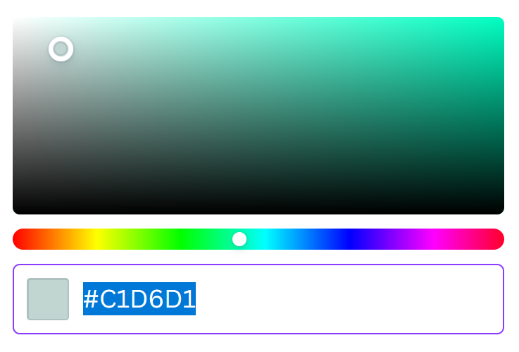
If you are looking for muted colors, try going more to the left side of the color picker to give your color some grey undertones. If you want bright colors, move to the right side. If you need a slightly different color tone, just move the bottom slider a bit.
Play around with the color picker until you have your six shades. If you find it difficult to get the shade the way you want it, you can always browse my color palette collection and use those shades, or use them as a jumping off point. Just add the color code in the color picker and go from there.
When you’re happy with your shades you can fill in the right color codes. This is what I chose:
Done!
Time to celebrate your awesome achievement! 🙂 You now have a beautiful and versatile color palette to use when creating visuals for your brand.
2 Comments