You can never go wrong with neutral colors. I would even say that every visual brand identity needs at least one neutral color! I’ve curated 5 beautiful palettes for you to use directly in your visual branding, or just to draw inspiration from. You can also mix & match your favourites ofcourse.
How to use color codes
Simply type the # color code into the color picker of your design tool such as Canva or Adobe Illustrator. Found a palette you love? Feel free to use, and to pin it to your pinterest boards.
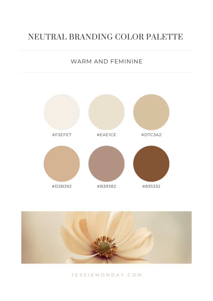
Warm and feminine neutrals
Let’s start with a warm neutral palette with a feminine vibe. The first three colors have that golden look, perfect for a more high end branding.
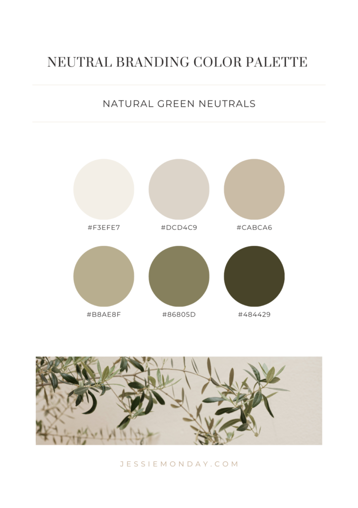
Natural green neutrals
I’m a huge plant lover so this next palette is totally my thing. Those grey-ish olive colors, aren’t they just stunning? Perfect to give your brand/business a fresh touch.
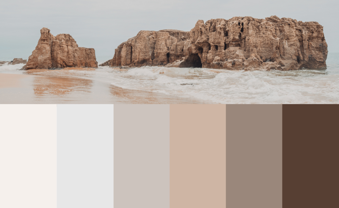
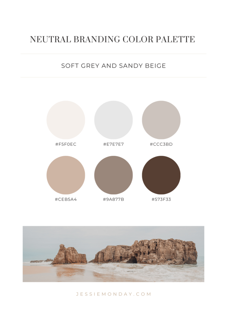
Soft grey and sandy beige
Inspired by the beach, these soft greys and warm beige tones go together perfectly.
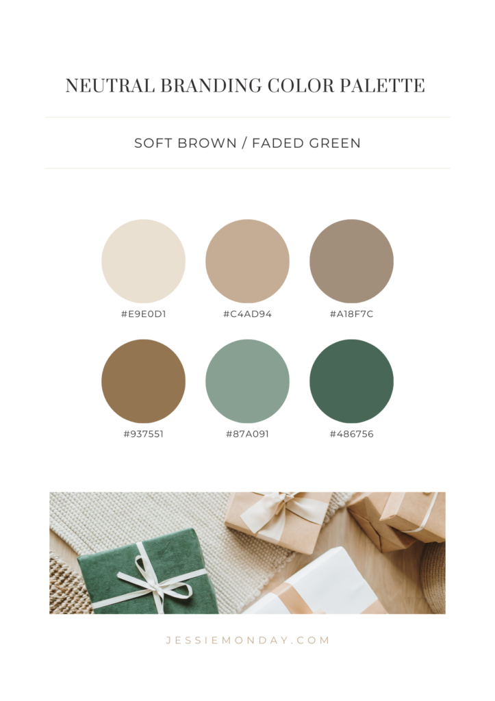
Soft brown and faded greens
Don’t be afraid to add a pop of color to your neutral palette! These two green tones for example give this color scheme a little more ‘body’ while remaining quite neutral.
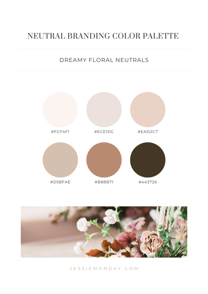
Dreamy floral neutrals
If you’re looking for warm neutral colors, this might be your thing. These blush colors paired with the warm brown tones make a beautiful color palette. This would be perfect for a flower business, a brand of luxury chocolates or a boutique clothing store.
1 Comment